Skip to content

cearta.ie

the Irish for rights

Menu
  • About
  • Privacy Policy
  • Disclaimer
  • Contact
  • Research

Category: Typography

Gallimaufry

5 November, 201023 November, 2010
| 2 Comments
| Blasphemy, Broadcasting Authority of Ireland, Censorship, ECHR, Gallimaufry, Phones in class, Typography

Gallimaufry
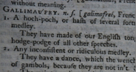
Dr Johnson defined gallimaufry as

1. A hoch-poch …
2. Any inconsistent or ridiculous medley. …

Here’s another hoch-poch, or hotch-potch (though, of course, not a hotchpot) of links relevant to the themes of this blog that have caught my eye over the last while. I’ll begin and end with some stories of censorship, and along the way I’ll mention open wifi, international perceptions of Ireland, typography, mobile phones, broadcasting, and the future of our universities.

First, as a supplement to my post on the Lady Chatterley’s Lover trials, Alan Travis in the Guardian argues that the failure of the Chatterley prosecution secured the liberty of literature in Britain over the past 50 years. By way of a similar supplement to my post on the decision of the European Court of Human Rights in Akdas v Turkey 41056/04 (15 February 2010) that a Turkish ban on Apollinaire’s Les Onze Mille Verges infringed Article 10 of the European Convention on Human Rights, the Guardian reports that Turkey is at it again: publisher Irfan Sanci is being prosecuted – under the same Turkish provisions that were found wanting in Akdas – for publishing a translation of another Apollinaire noverl, Les exploits d’un jeune Don Juan (The Exploits of a Young Don Juan).…

Read More »

What your font says about you

19 September, 201022 October, 2010
| 3 Comments
| Typography

Adobe Calson lower case a, via Wikipedia.Derek H Kiernan-Johnson has just put his paper “Telling Through Type: Typography and Narrative in Legal Briefs” on SSRN (hat tip Law & Humanities Blog). He notes that Chief Judge Frank Easterbrook has (pdf) deprecated

bad typography, home-brewed by lawyers just because word-processing software allows you to bypass professional printers. Unfortunately, … [lawyers] have not gone to printers’ school. Desktop publishing does not imply a license to use ugly or inappropriate type and formatting — and I assure you that Times New Roman is utterly inappropriate for long documents despite the fact that it is the default in some word-processing programs. It is designed for narrow columns in newspapers, not for briefs.

In my post Typography for Lawyers, I briefly referred to the website of the same name maintained by Matthew Butterick (interviewed here; reviewed here) as a remedy for these ills. Indeed, Dan Michaluk on Slaw expressed his preference for Helvetica the movie as well as the modern, minimalistic and neutral font.

In Kiernan-Johnson’s view, however, typography has the potential to go very much further: the

shapes, the spacing, of letters and of words can reinforce, compliment, and independently create narrative meaning. Or, intentionally or unintentionally, it can cut against it.

…

Read More »

Lawyers for Typography

14 August, 200922 October, 2010
| 6 Comments
| Typography

Brass plate; capital B - via FT site.A little while I ago, I blogged about the deservedly-popular site Typography for Lawyers; now a story by Joel Alas in the Financial Times (hat tip: The Faculty Lounge) brings news of lawyers for typography, or more to the point, potential litigation about the most (in)famous font type in the world – Times New Roman. First, some background: on Typography for Lawyers, Matthew explains that the Times New Roman font

has been with us since 1932, when the Times of London (the newspaper) hired font designer Stanley Morison to create a new text font, which was based on historical Dutch designs. Because the font was being used in a prominent daily paper, it quickly became very popular when it was released for general commercial use the following year.

Despite the success of the font, legal wrangling was not far behind (is it ever?) …

The FT story now brings news of more potential legal wrangling – Mike Parker, one of the world’s leading experts on type, claims that in 1904 William Starling Burgess created the font we now know as Times New Roman. Parker’s evidence is twofold. First, he has a series of 1904 drawings for font Number 54 signed by Burgess, prepared by him for the Lanston Monotype company to be used for company documents at the Burgess shipyard in Marblehead, Massachusetts.…

Read More »

Typography for Lawyers

24 July, 200922 October, 2010
| 4 Comments
| Typography

Adobe Calson lower case a, via Wikipedia.I love this website: Typography for Lawyers. Typography is the visual component of the written word, and even though the legal profession depends heavily on writing, legal typography is often poor. So, Matthew Butterick has started that site as a guide to typography for lawyers – in his view, good typography makes written documents more professional and more persuasive. He gives a wonderful example of where bad typography led to serious problems (I won’t spoil the effect, click through to find out for yourself); and he gives very sage advice about using the Times font (advice which I only occasionally take, but then, do as he says, not as I do!). This is a wonderful website. Go, read, learn, enjoy.…

Read More »

Welcome

Me in a hat

Hi there! Thanks for dropping by. I’m Eoin O’Dell, and this is my blog: Cearta.ie – the Irish for rights.


“Cearta” really is the Irish word for rights, so the title provides a good sense of the scope of this blog.

In general, I write here about private law, free speech, and cyber law; and, in particular, I write about Irish law and education policy.


Academic links
Academia.edu
ORCID
SSRN
TARA

Subscribe

  • RSS Feed
  • Twitter
  • LinkedIn

Recent posts

  • A trillion here, a quadrillion there …
  • A New Look at vouchers in liquidations
  • Defamation reform – one step backward, one step forward, and a mis-step
  • As I was saying before I was so rudely interrupted … the Defamation (Amendment) Bill, 2024 has been restored to the Order Paper
  • Defamation in the Programme for Government – Updates
  • Properly distributing the burden of a debt, and the actual and presumed intentions of the parties: non-theories, theories and meta-theories of subrogation
  • Open Justice and the GDPR: GDPRubbish, the Courts Service, and the Defence Forces

Archives by month

Categories by topic

Licence

Creative Commons License

This blog is licensed under a Creative Commons Attribution-NonCommercial 4.0 International License. I am happy for you to reuse and adapt my content, provided that you attribute it to me, and do not use it commercially. Thanks. Eoin

Credit where it’s due

Some of those whose technical advice and help have proven invaluable in keeping this show on the road include Dermot Frost, Karlin Lillington, Daithí Mac Síthigh, and
Antoin Ó Lachtnáin. I’m grateful to them; please don’t blame them :)

Thanks to Blacknight for hosting.

Feeds and Admin

  • Log in
  • Entries feed
  • Comments feed
  • WordPress.org

© cearta.ie 2025. Powered by WordPress